It's back, the colour of the year! The colour experts at Pantone have chosen Very Peri as the trend colour for 2022! Curious about how you can integrate this purple shade into your interior? We already have some inspirational images to get you started. Discover how print decoration in Very Peri colours will breathe new life into your interior!

Very what? Very Peri!
Pantone, a colour institute and the reference in colour trends, chooses a new colour every year that will determine the trends in fashion, graphic design, interior design, etc. For the year 2022 they chose Very Peri, a mixture of violet-red and blue. Very Peri symbolizes creativity, optimism and the fusion of our physical and digital lives. The trend colour is a shade that you will not easily find in nature, but which is common in the digital world.

Lively and optimistic
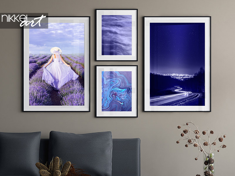
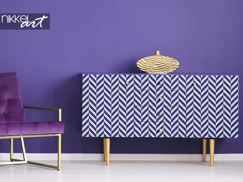
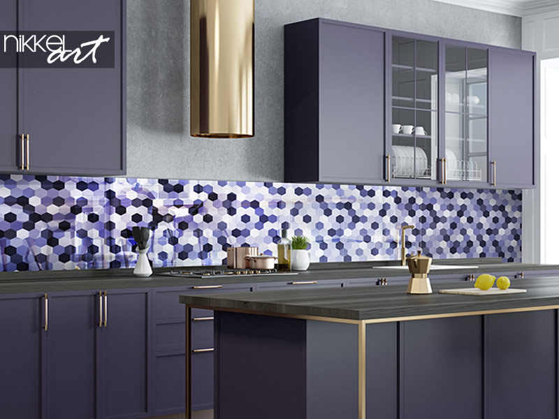
The pandemic has forced a lot of people to stay at home during the past 2 years and our physical and digital lives have merged in new ways. With Very Peri, Pantone aims to help consumers “embrace a changed landscape of possibilities and open their eyes to a new vision”. Very Peri is therefore a bold and vibrant colour that perfectly matches our cautious desire for an optimistic future. The ideal interior colour to let a breath of fresh air blow through your home! How about a trendy gallery wall with framed posters in Very Peri shades? Or brighten up an old closet with a Veri Peri furniture sticker? Even in your bathroom and kitchen you can easily apply the trend colour with the help of a custom-made glass splash back with Very Peri colours!

Colour combinations with the trend colour of 2022
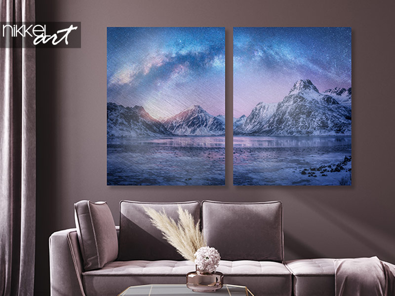
Very Peri is a fresh colour that comes into its own in various interior styles. The trend colour is a combination of cool blue and warm violet-red. As a result, the colour fits very well with light tones, such as white, ecru and gray, as well as warm colours, such as mauves and browns. A versatile colour with which you can make your interior completely on-trend.

Pantone 2022 veri peri
Want to receive new inspiration every day? Be sure to follow Nikkel Art on Instagram!


